Rebranding & Packaging Progress Report
Summer is the best time of the year to get caught up on creative projects that are important, yet get shoved to the back burner the rest of the year. Something about that extra bit of sun, longer days and time to relax at the beach seems to consistently bring more focus and allow me and my creative team to get fully immersed in such undertaking.
And this year, my graphic designer and I are finally getting this done - rebranding and new packaging design for my 4 collections: Signature, Agent M, Language of Flowers and Liquid Poetry. Here are some snapshots from our very first meeting of asessing mockups for the 3D packaging solutions. Please ignore the hand-cut quality of these mockups. It's the look we're after, not the finesse of the details (which will come later, once it's all printed professionally, cut in the same manner, and hand-assembled by yours truly and my little elves - all known for great attention to detail and meticulous dedication to perfection).
Signature collection - outer packaging treatment. Variation in colours will also reflect each bottle's label.
Agent M Collection - this is more masculine (or possibly unisex). We might have colour variations, but these are the first 3 options for an overall look. Possible to have 2 colour variations for "cool" and for "warm" scents. But no more than that.
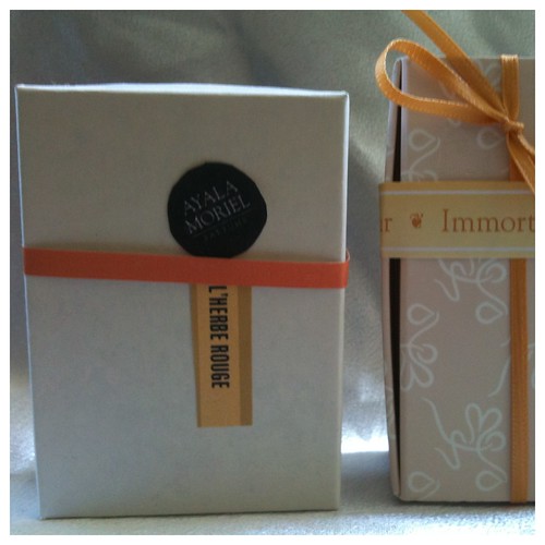
Agent M outer packaging treatment.
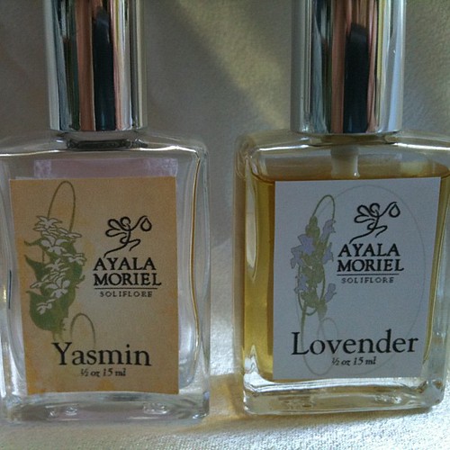
Language of Flowers Soliflore Collection. 2 different treatments - and the next ones will be somewhere in the middle (and probably vertically oriented...).
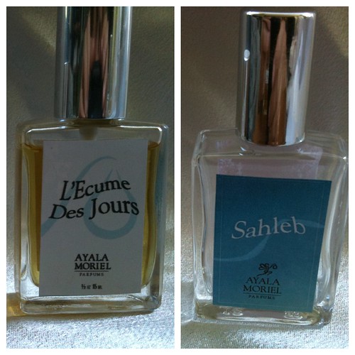
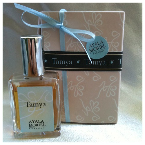
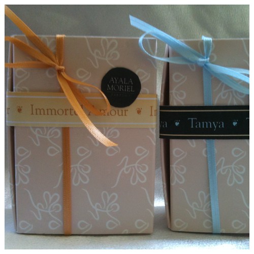
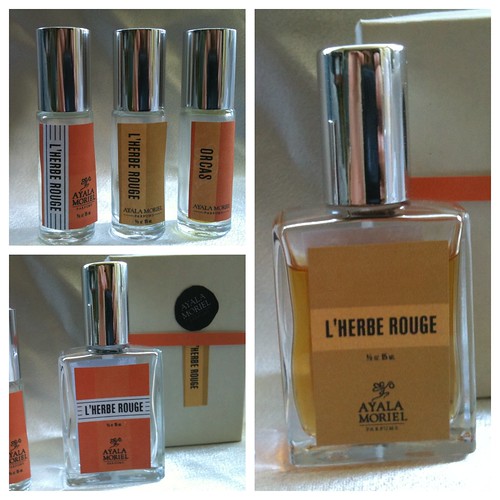
Liquid Poetry Collection. These are made of the most exquisite oils, abstract concepts at times, and the focus has to remain the jus in the bottle. Not likely to have any colour variations in the labeling.
The journey continues, and there is still much work to be done on all fronts (not to mention printing, cutting and assembling all these once the designs are ready). But it's all beginning to become clearer and I'm happy that we are making the most out our resources (existing bottles and boxes) yet creating a new fresh look that will better reflect the individuality of each perfume in a less monotonous way (the previous branding established the Ayala Moriel brand; the new branding is supposed to highlight the qualities of each scent or "collection" and make it easier for my customers and clients to pick as scent more intuitively; yet without the risk of visual clutter).
I'm happy to share these with you, and although I'm happy with the direction it's all going and know this is what I've envisioned, it's always great to hear feedback from my customers as well. So feel free to comment!
